4 Tips for How to Choose Colors for Photos
The number one question I get asked is, “What do I wear for my photo session?” A good place to start is by choosing a color palette. Choose a palette first, THEN decide what to wear within that palette. The idea is to coordinate each person being photographed within that color palette rather than having people match completely. To do this, vary textures, styes and patterns within that palette. I’ve said it before, but it warrants repeating….please do NOT show up in matching white shirts. 🙂 Do not put everyone in the same color at all. Coordinate colors within a theme, but don’t match completely.
I’ll be posting a bunch this spring about what to wear for photo sessions. I also wrote a blog post last year about spring photo clothing choices, which you can find here. Below are some tips on deciding which colors to wear for your photo session.
Table of Contents
1. Pick Colors for Photos that Complement Your Skin Tone
When deciding what colors to wear for photos, first think about colors you love to wear. Pick colors that make you look and feel your best. You’ve probably noticed that you tend to re-wear pieces that fall within a certain palette in your closet. Most likely, you are wearing colors that best complement your skin tones.
If you don’t know what tones look best on you, start with determining whether you are a cool, neutral or warm skin tone. Turn off overhead lights and stand next to a window. Look at the underside of your wrist in the window light.
- If your veins look blue or purple in natural light, you most likely have cool skin tones.
- If your veins look green or olive in natural light, you mostly likely have warm skin tones.
- If your veins look blue-green, you likely have neutral skin tones.
There is a ton of information about this on style websites, but if you want to go into a deep dive about finding your tones, check out this website. It goes into a lot more depth about under- and overtones, along with jewelry and how eye and hair color influence your color schemes.
So you’ve figured out your undertone temp…..now what?
Cool Tones
People who have cool skin undertones tend to look great in jewel tones. People with cool undertones tend to look their best in cool blues, lighter pinks, emerald green, purple, navy blue, white, and black. Neutrals tend to fall into bright white and cool grays.

Warm Tones
People with warm skin undertones tend to look better in earthy colors. Olives, mustard, burgundy, orange, cream, ivory, warm browns and rosy pinks work well for people with warm skin undertones. Neutrals also tend to be warmer, including cream, tan, and warmer browns.
Neutral Tones
People with neutral undertones can wear both cool and warm tones, but they generally lean toward either warm or cool. They also might lean toward either cool or warm more seasonally. For example, I am a neutral, but my hair color is warm and my eye color is cool. I find myself wearing more cool colors in the winter and warm colors in the summer months. My neutrals always stay on the cool side, for some reason (I look sick in ivory, cream or brown….it’s white, black and grey all the way for me).
I know what you’re thinking….but what if every family member has a different undertone? I’m getting there. And I promise it will work. My family, for example, consists of two warm undertones and two neutral undertones.
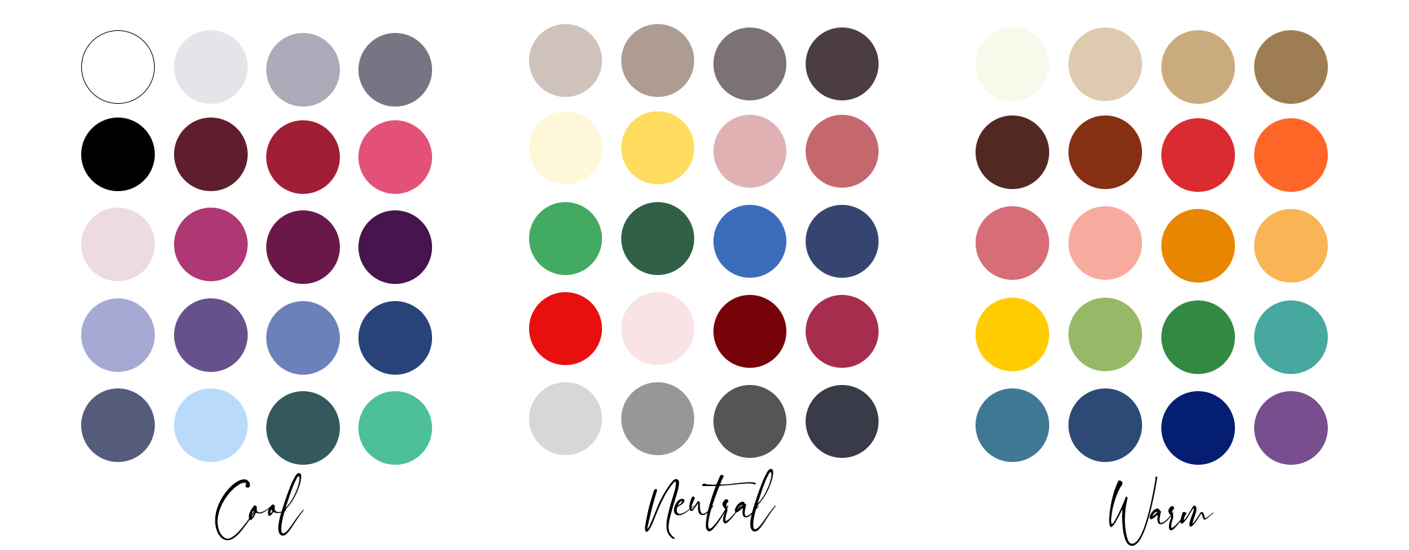
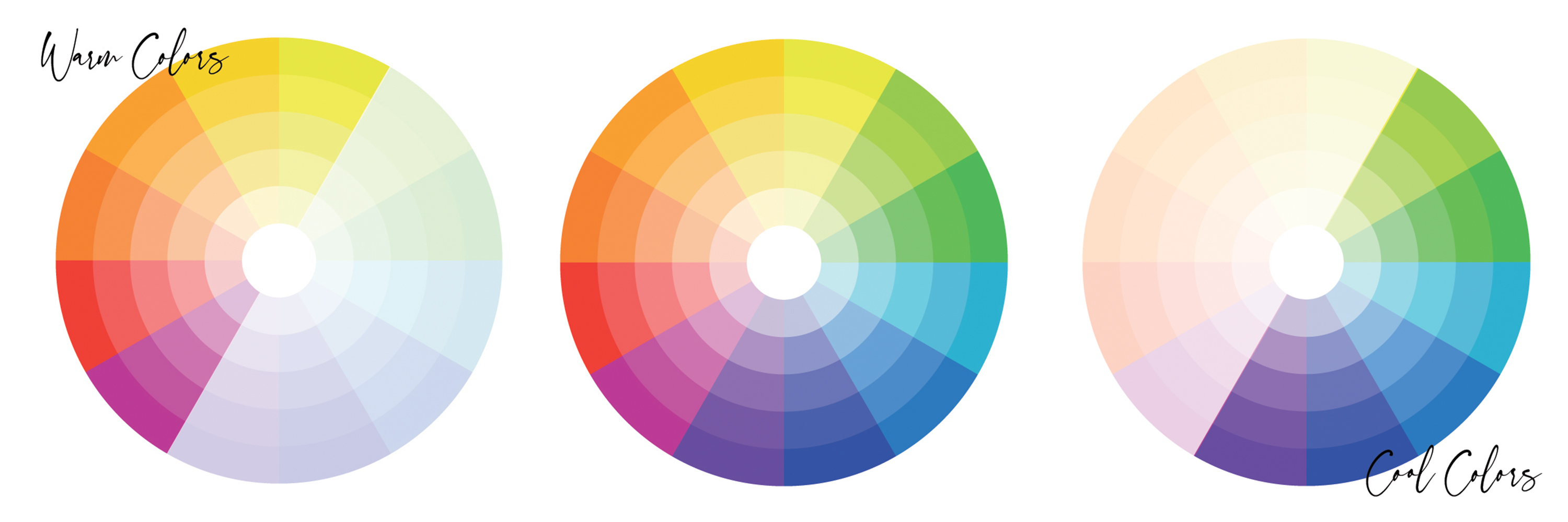
2. Use the Color Wheel to Guide Color Schemes
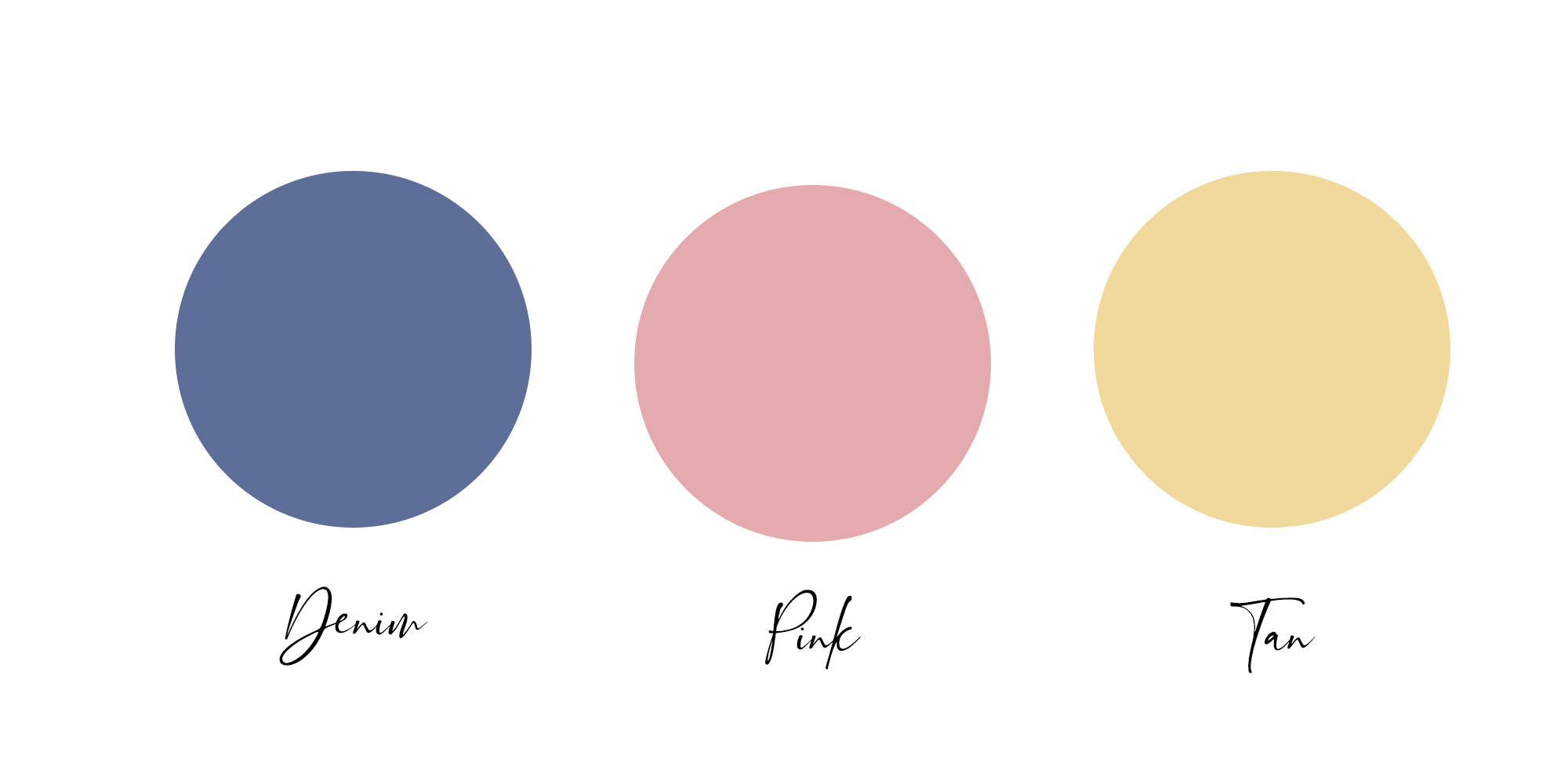
Next, let’s look at putting colors together. The color wheel helps us do just that. The color wheels below are just examples. Most color wheels have many more shades and tones within each color grouping, but the ones below will give you a general idea.
As you can see below, warm and cool tones are on opposite sides of the color wheel (full wheel shown in the middle)…..
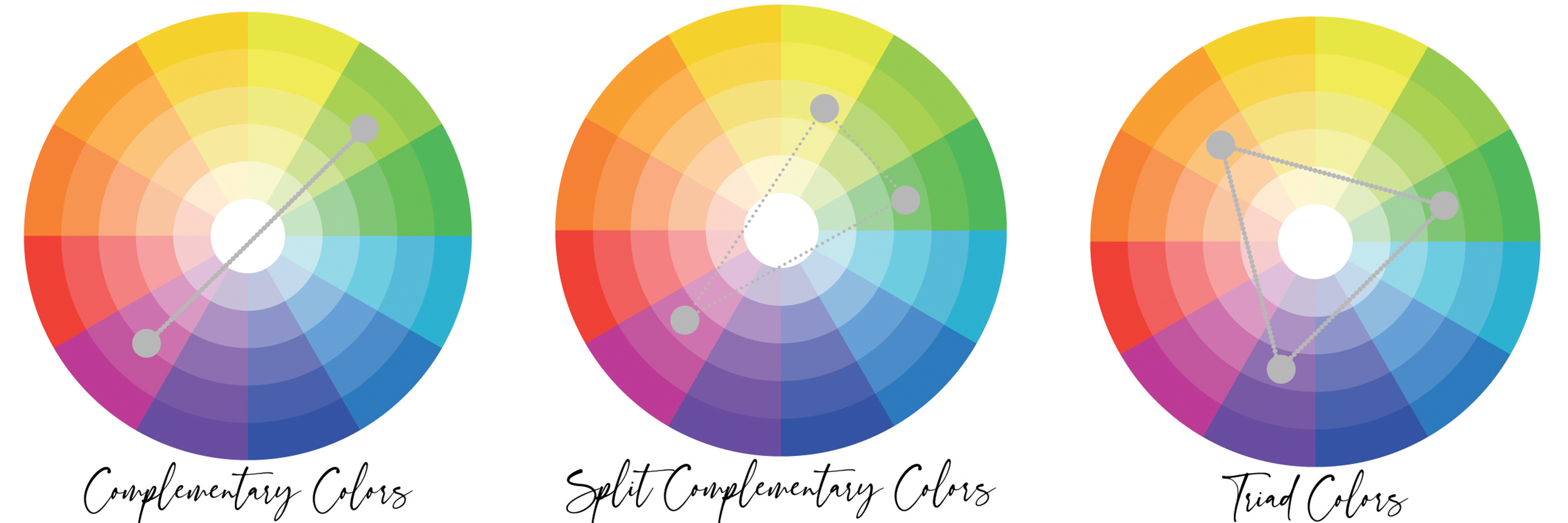
If you have a mix of different skin undertones in your family, for instance, you have cool undertones and your spouse has warm undertones, you can tie your color palette together by choosing complementary colors across the color wheel. (Yet another reason NOT to put everyone in the same color!)
Also, the colors you choose to wear for photos don’t necessarily have to be the colors that are directly across from each other in the color wheel. If you pick one color, look across the wheel and pick the two colors just adjacent to the complementary color. By doing this, you are choosing “Split Complementary” colors (see middle wheel below). If you make a perfect triangle on the color wheel, you’ll pick “Triad” or “Tertiary” colors (far right wheel below).
Generally, don’t choose any neon colors for photos. Bright orange, bright pink, neon yelllow, or neon green can put color casts on skin and will not photograph well.
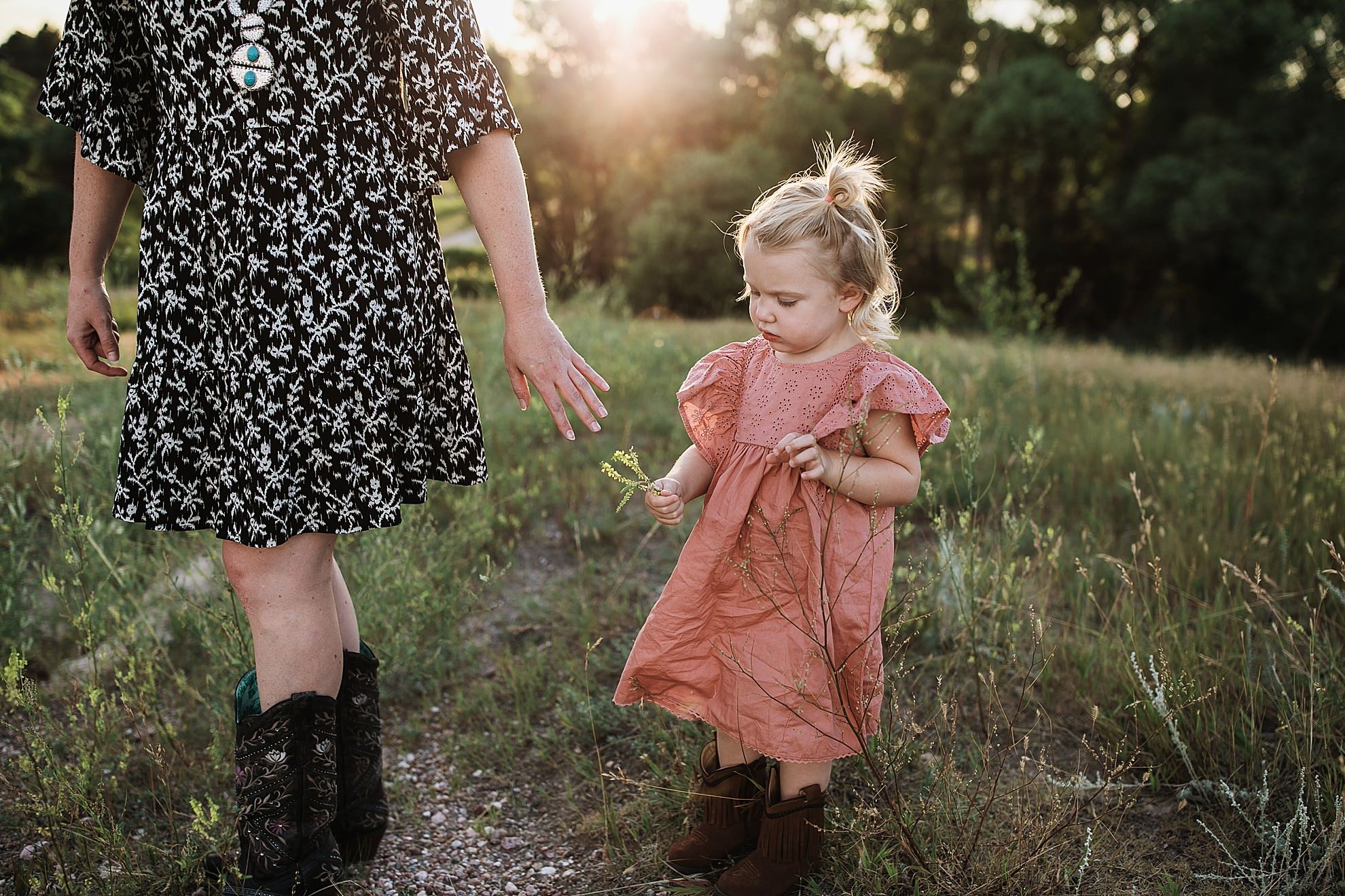
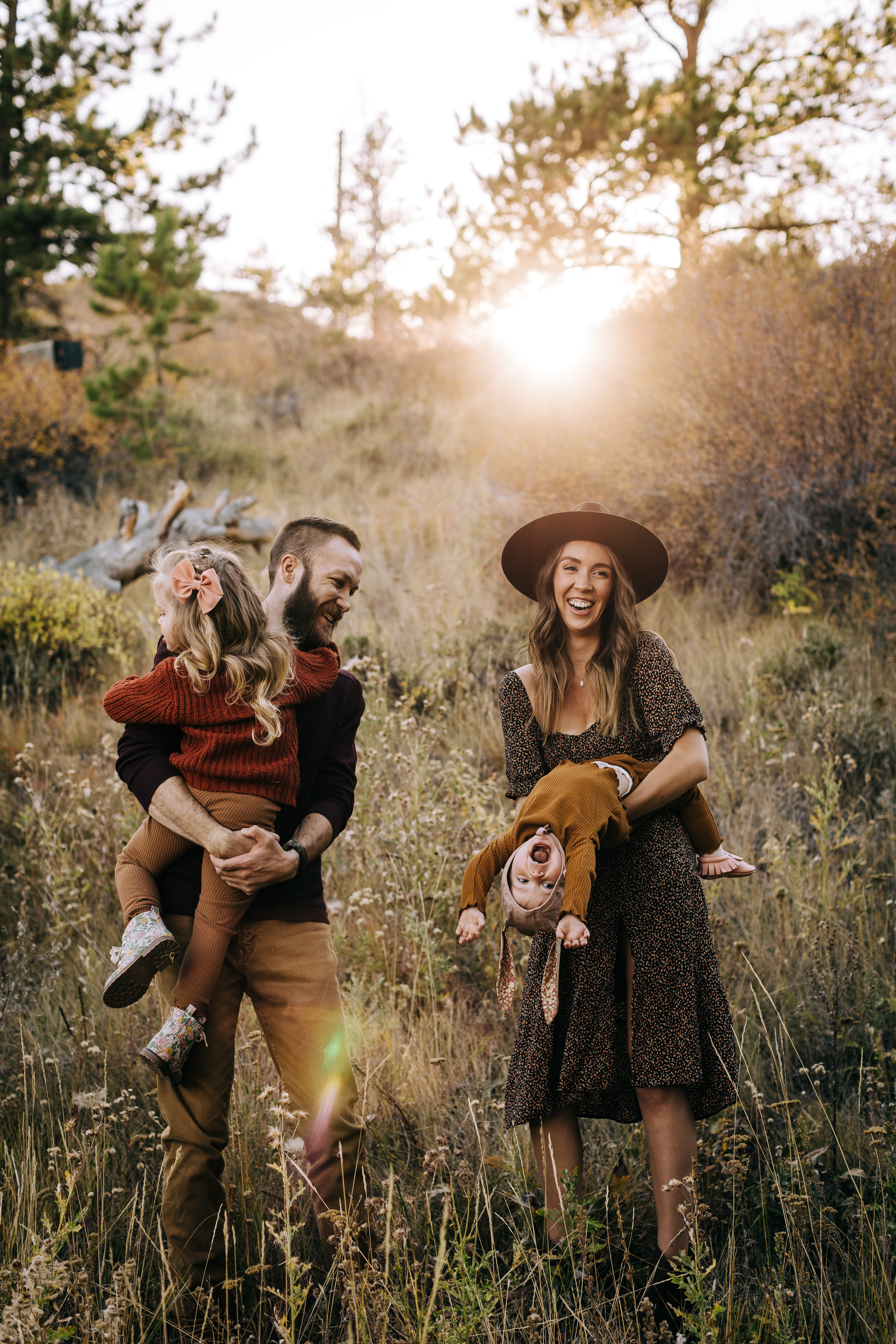
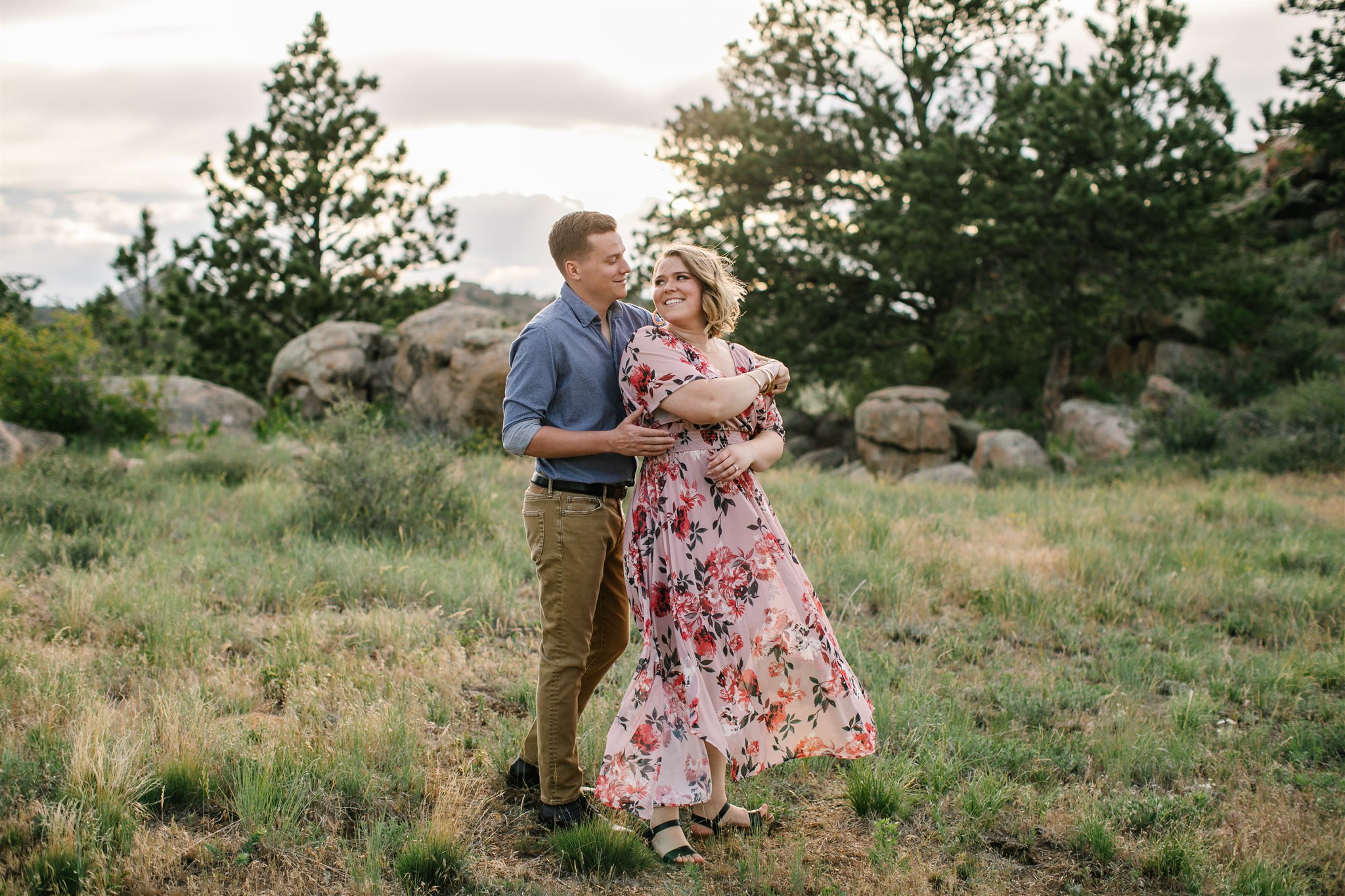
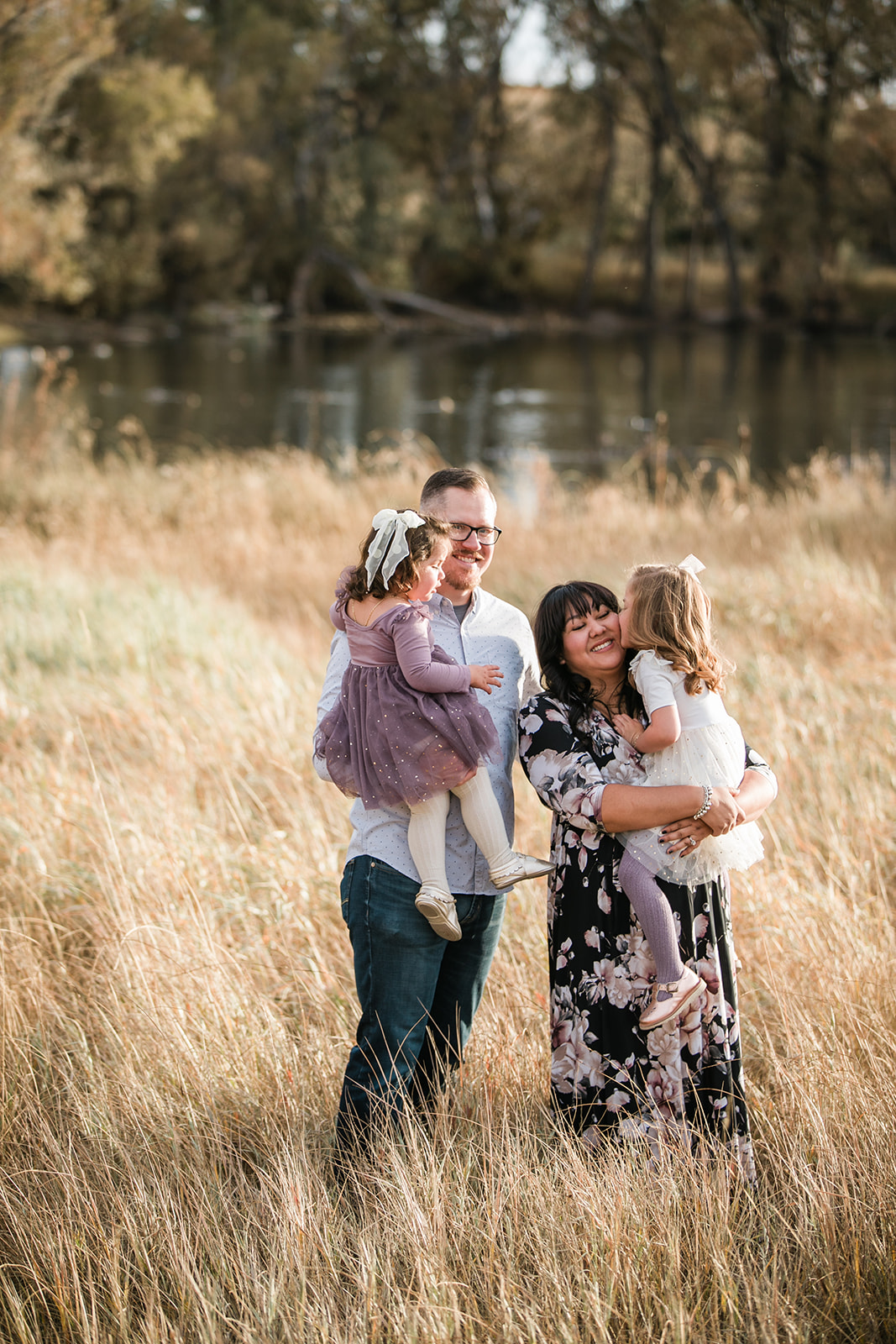
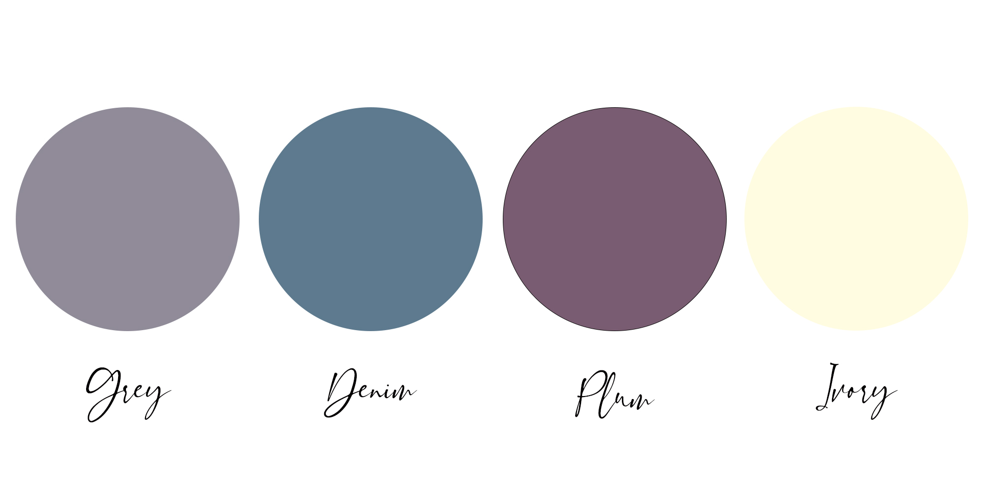
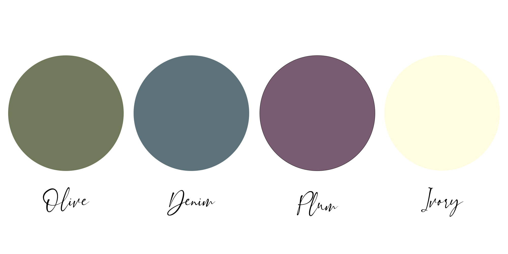
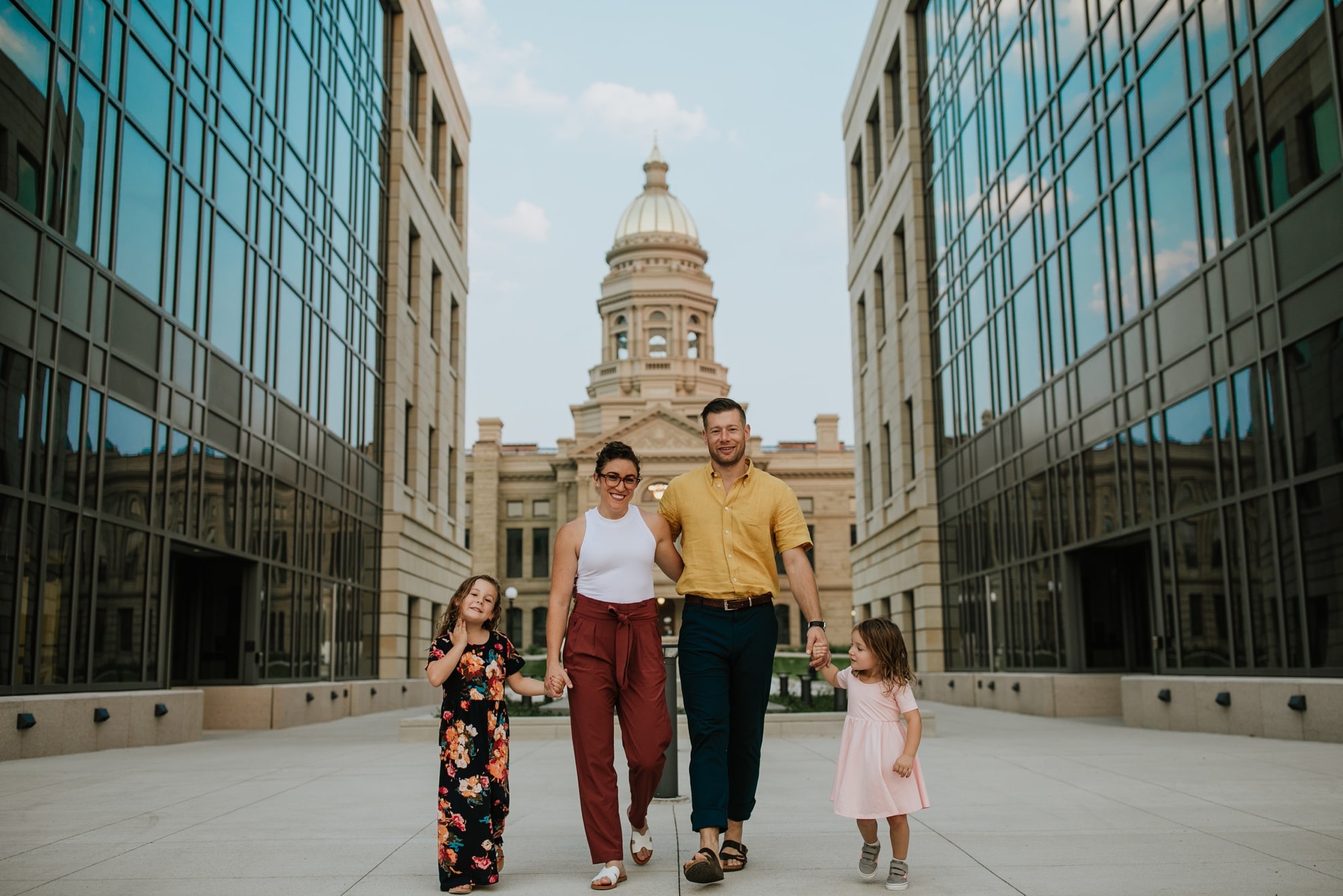
Here’s an example of putting colors together for photos using my family.
My husband and youngest daughter have warm undertones, and my oldest daughter and I have neutral undertones.
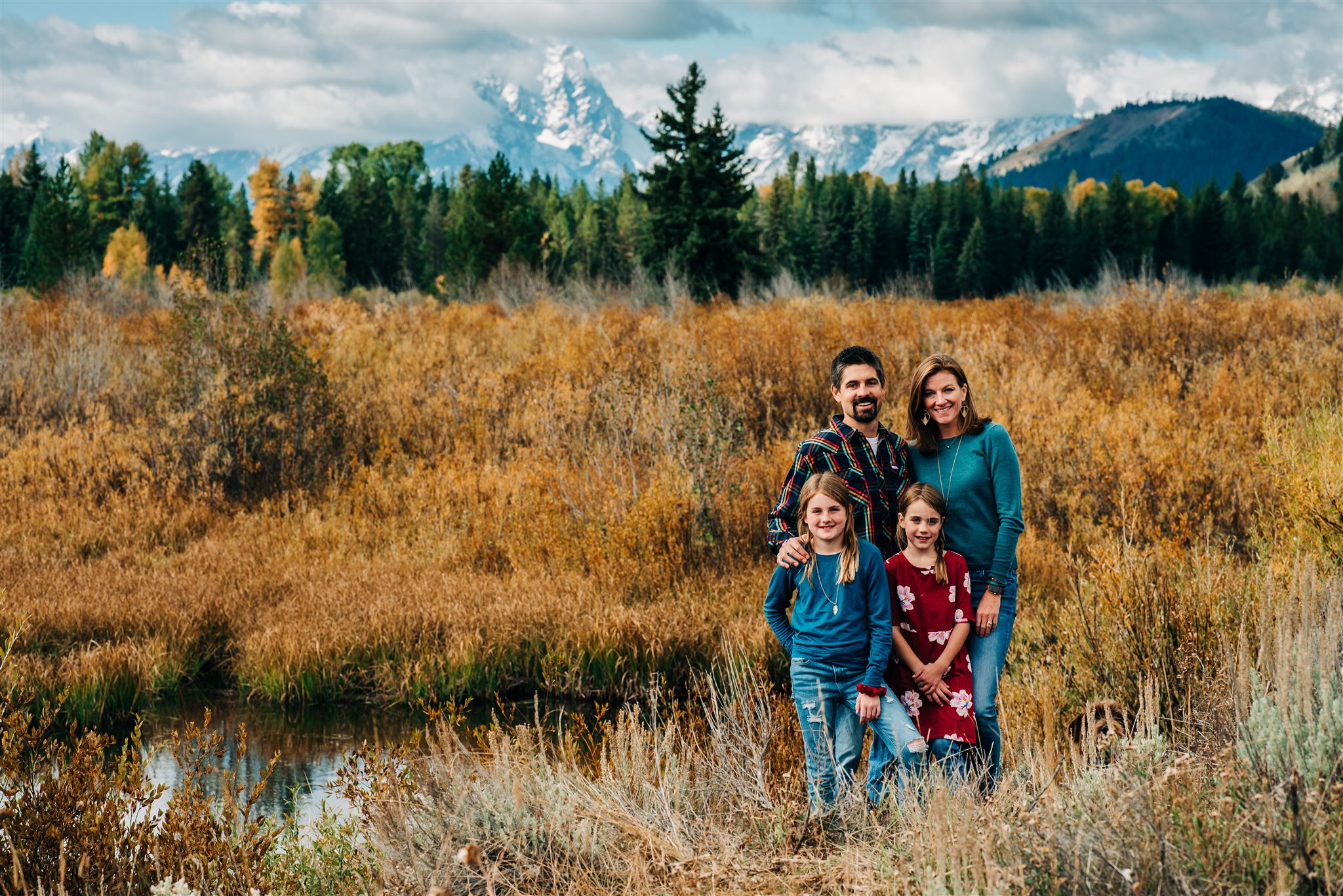
For this photo, we chose a Split Complementary color pattern from a warm teal base. This photo also gives a good example of coordinating colors but not matching completely. I realize my oldest’s shirt and my shirt are pretty much the same, but that’s a long story about traveling and packing that I won’t get into here. The print pattern in both my hubby’s and youngest’s shirts help offset the matching nature of the two teal shirts.
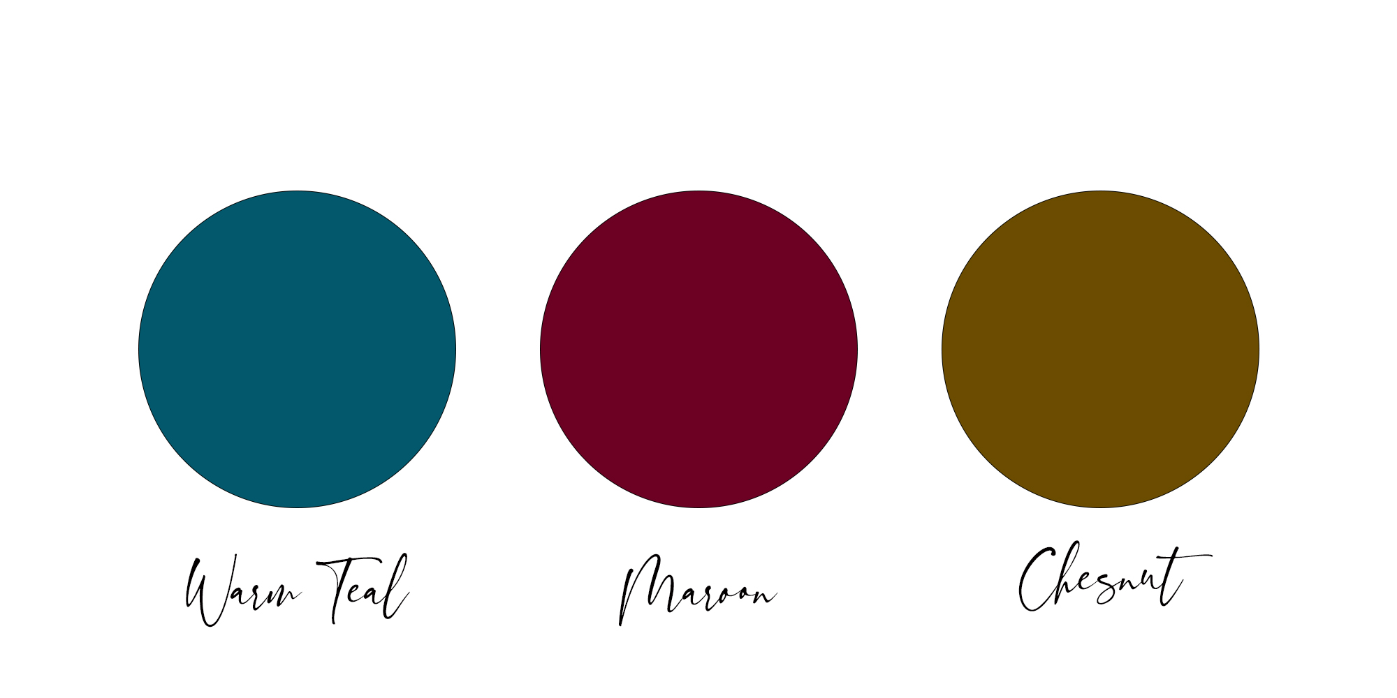
There’s also a navy in that combo that works well, along with an ivory neutral in my daughter’s patterned shirt. The chestnut is mostly coming out in the texture of the surrounding grass, and Andy has some of that in the pattern of his shirt. The palette above is definitely a fall palette, which brings me to my next point….the season and surrounding natural colors should also influence your decision when choosing colors for a photo session.
3. Choose Colors to Wear for Photos Based on the Season
Use the season to determine the general tones for your photo session. Let the surrounding colors that nature offers help you determine which colors to wear for photos. Yes, even in Wyoming, the colors of our natural surroundings change. Incorporating the natural surroundings into your palette can definitely make everything sync in your photos.
For Fall, Choose Warm, Earthy Tones
Fall tones are super warm, and they include the earth tones. For fall photos, you can safely choose colors that fit right into that earth tone category, mixing in neutrals as needed to balance out different skin tones. Here are a few examples of that below.
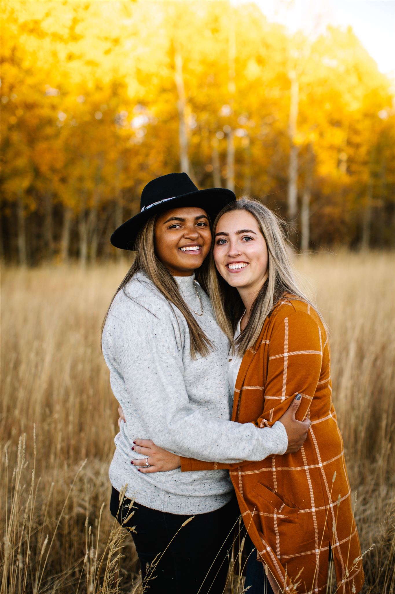
I am still unpacking the wonder that Alexa pulled off for her family photos. Using her dress, she built a color palette that complemented it. She picked Analogous colors in the wheel, and combined with the warm tones of fall, it was magical. She also threw in a tiny bit of blush, which became a balanced neutral in this case.
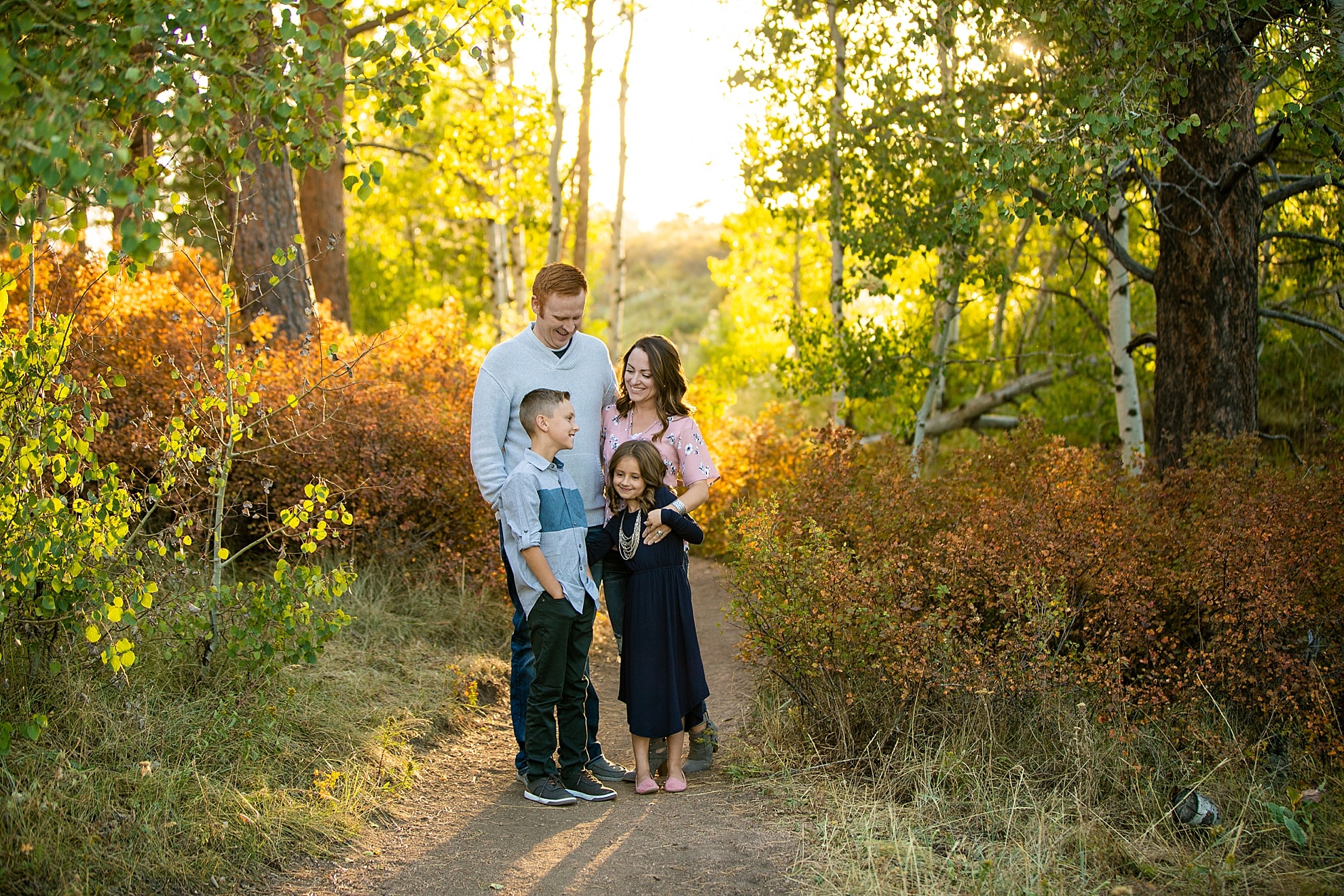
To keep things simple, just pick one earth tone and pair it with neutrals, like Emily and Marquelle did at the peak of aspen color last year. Emily wore a burnt orange top, and Marquelle chose neutrals, opting for oatmeal, gray and black.
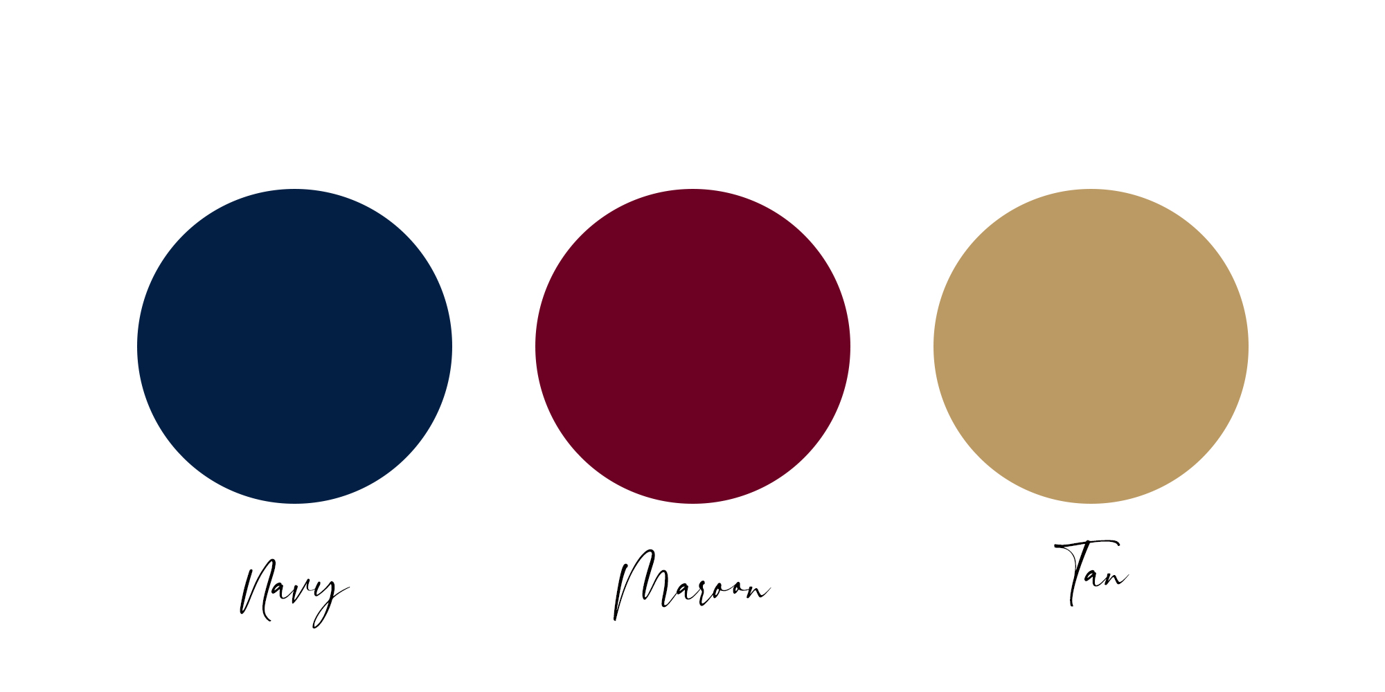
For some reason, navy and burgundy are two of my go-to colors to wear for fall photos. They always work for mountain photo sessions in the fall.
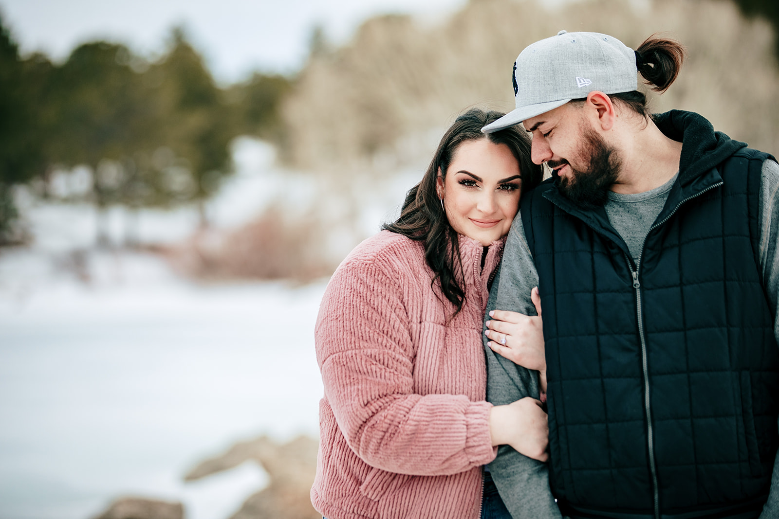
In Winter, Opt for One Pop of Color
While fall is full of warm colors, winter tends to be characterized by a lack of color and cooler light. I typically suggest that people opt for at least one strong pop of color in winter photos. Not everyone has to wear a ton of color, but one ‘wild card’ piece tends to provide a visual pop of interest.
Dami chose a pink sweater that complemented her skin tones perfectly, and her fiancé wore neutrals, as you can see below.
Elaine and Peter did this really well too.
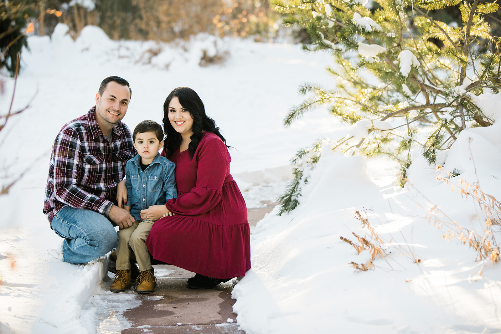
As you can see, maroon or burgundy span both the fall and winter seasons well and provide an easy pop of color for holiday months.
For Spring and Summer Photos, Choose Cooler Tones and Florals
Spring and summer are going into the same category here, because I think of both as having more cool greens and blues in general. Pinks, greens and blues all work well for photo sessions in the spring and summer. I love flowery dresses and some lighter colors for spring and summer photo sessions.
You can also just pick out one color, like Kassie did with her green dress, and then add in neutrals.
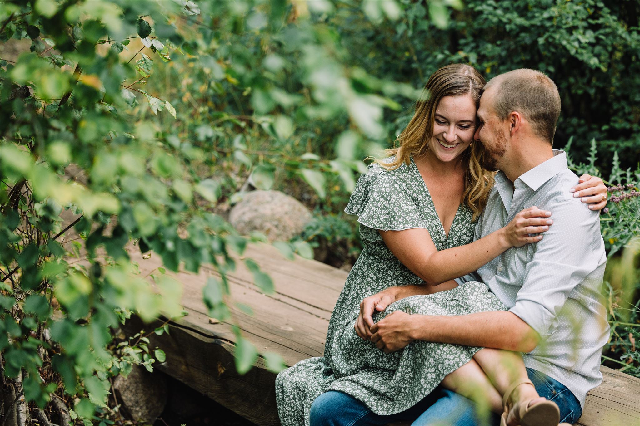
Don’t be afraid of going with analogous colors for spring and summer, especially in softer tones. They work really well, like the example below.
Or add a complementary tone here and do something like the following example.
4. Pick One Outfit and Build a Color Scheme for Photos from There
Finally, use the wild card rule. For families, it’s usually mom’s outfit that sets the tone for the family. For couples, one of the partner’s outfits generally is more of a tone-setter. If you fall in love with a piece, use it as your starting point for your session, and build the rest of the outfits around that piece. I promise you can almost always find tones within the warm/cool/neutral categories to coordinate everyone. Use neutrals wisely to balance out really bold pieces, or heck, go with all neutrals….just vary shades/tones and textures so you don’t look too matching.
Let Me Know if I Can Help!
As always, please reach out with specific questions about choosing color for your session. I’m also offering a new styling service as part of my packages, and I’m finally getting around to starting an email newsletter. Sign up for the newsletter below to receive more what to wear tips. If you’ve already booked a family or engagement session, the new app that can help you style your family or you and your partner will be hitting your inbox soon.
If you need to book a family photo session or senior photo this summer in Cheyenne or Laramie, I have released my family and senior calendars and they are filling fast. Here are the links to those:
Family Photo Sessions Near Cheyenne or Laramie